Traditionally, theme authors would style everything from a stylesheet—and they still sometimes must. In modern WordPress, you can also style most, if not all, of your theme directly from your theme.json file.
When you use this standard system, it is also reflected in the Appearance > Editor > Styles interface. This means your theme’s users with access to that admin screen can also make changes that easily work alongside your theme’s styles. But it also means that you can design your theme directly from this visual interface if you choose to do so.
theme.json supports styles at three different levels:
- Root (global)
- Elements
- Blocks
In this document, you will learn the syntax necessary for styling each of these things via JSON.
Styling the root element
When referring to the “root” element in WordPress themes, we’re specifically talking about the HTML <body> tag. It’s the root of the visual output for the page.
Technically, when styling the root element, you are adding global styles that trickle down through the design and are used unless a more specific element or block style overrides them. For example, you’ll likely want to set a default font-family or font-size that is used across the entire design. But you’ll, of course, want to change that in specific instances.
Because these are global styles, it means that they belong directly under the styles property.
So let’s add a default text and background color to show how this works:
{
	"version": 2,
	"styles": {
		"color": {
			"text": "#000000",
			"background": "#f5f1ea"
		}
	}
}
As you can see, the color property is nested directly beneath the styles property. This means that the text and background colors are applied directly to the <body> element by WordPress, resulting in this CSS in the editor and on the front end:
body {
	background: #f5f1ea;
	color: #000000;
}
And because of the way the cascade works in CSS, these colors will be used for everything, unless a more specific style rule overwrites it.
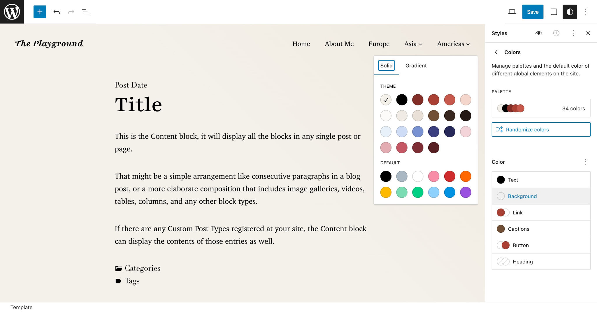
If you open your site on the front end or via Appearance > Editor in the WordPress admin, you should see your colors applied:
You are not just limited to colors. You can add typography, spacing, and more here. The root element supports almost all of the available style properties, which you can reference in the Supported Styles documentation.
The styles.spacing.padding property has a unique use case when used in conjunction with settings.useRootPaddingAwareAlignments. For more information on how these two work together, read the Use Root Padding Aware Alignments documentation.
Styling elements
WordPress has a standard system for styling elements via theme.json. In this case, “elements” usually maps to actual HTML elements. But there are cases where it’s referring to something that doesn’t map directly to a single HTML element. In general, these should be reasonably straightforward.
Just like styling the root element and blocks, which you’ll learn about below, you can apply a wide range of the supported styles to elements.
The currently-supported elements are:
button: Applied to<button>elements and button-like links, such as that used for the Button block.caption: Applied to media captions, which are wrapped in a<figcaption>element.cite: Applied to the<cite>element when used for citations, such as that used for the Quote and Pullquote blocks.heading: Applied to all heading elements from<h1>through<h6>, but these can be overridden for individual headings.h1 - h6: Each of the<h1>through<h6>elements can be individually styled.link: Applied to the<a>tag, which is used to create links.
Let’s try a real example now. Suppose you wanted to give all buttons across the site a white text color that sits atop a red background. You need to target the text and background properties of styles.elements.button.color.
Add this code to your theme.json file:
{
	"version": 2,
	"styles": {
		"elements": {
			"button": {
				"color": {
					"text": "#ffffff",
					"background": "#aa3f33"
				}
			}
		}
	}
}
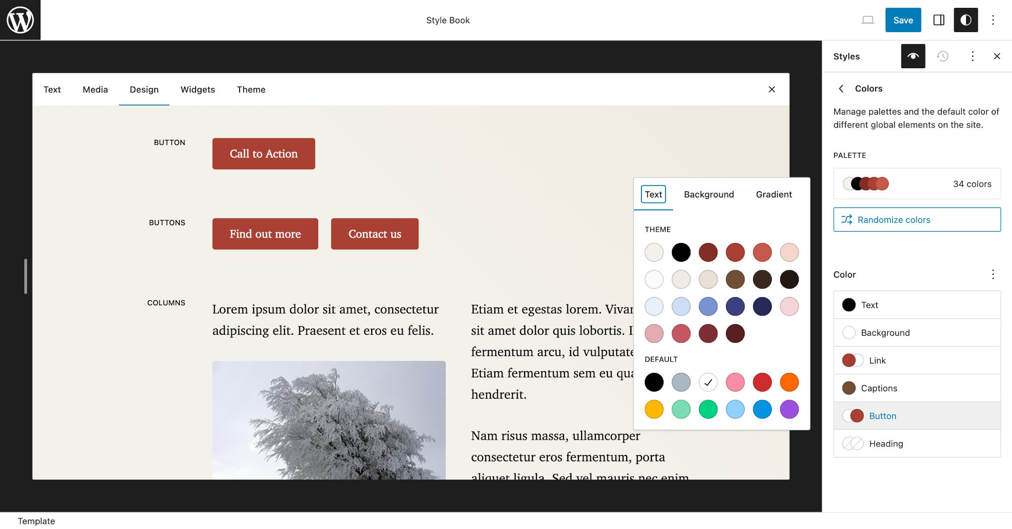
If you view a button in the Site Editor or on the front end of the site, you should see these colors applied:
Some elements both serve as element styles and the foundation of more specific blocks. In the case of elements that also tie into blocks, the block styles will overrule the element styles. For example, the Button and Heading blocks can have their own styles but they will fall back to the button and heading element styles.
WordPress will generate this CSS in both the editor and on the front end for your button element styles:
.wp-element-button,
.wp-block-button__link {
	background-color: #aa3f33;
	color: #ffffff;
}
WordPress sometimes—but not always—gives elements a specific CSS class with the naming scheme of .wp-element-{$element}. For example, button elements have the .wp-element-button class. The styles you provide via theme.json are then applied to that CSS class.
As you can see in the generated CSS, WordPress is targeting the .wp-element-button class when styling the button element. But it’s also specifically targeting the .wp-block-button__link class for backward compatibility with the Button block.
Styling pseudo-classes
You can also add style properties for a standard set of CSS pseudo-classes for some elements. Generally, this will be for features like link hover and focus styles.
The button and link elements support these pseudo-classes:
:hover:focus:active:visited
Each pseudo-class must be added as a property nested under the element you want to style. For example, you must target styles.elements.link.:hover to customize link hover styles.
Let’s look at this in context using the previous example of styling button elements. Suppose you wanted to change the background color when a user’s mouse hovers over buttons. Use this theme.json code to achieve that:
{
	"version": 2,
	"styles": {
		"elements": {
			"button": {
				"color": {
					"text": "#ffffff",
					"background": "#aa3f33"
				},
				":hover": {
					"color": {
						"background": "#822f27"
					}
				}
			}
		}
	}
}
Styling blocks
One of the great things about the block system is that it provides a standardized system for styling any block. This means that you can add styles for core WordPress blocks as well as third-party plugin blocks directly in theme.json.
To style a specific block, you must target styles.blocks.blockname in your theme.json file. From there, you can add any of the block’s supported styles.
Let’s take a look at a basic example. Assume that you want to give a slightly rounded border to all Image blocks. For this, you need to target the border.radius property.
Add this code to your theme.json file:
{
	"version": 2,
	"styles": {
		"blocks": {
			"core/image": {
				"border": {
					"radius": "6px"
				}
			}
		}
	}
}
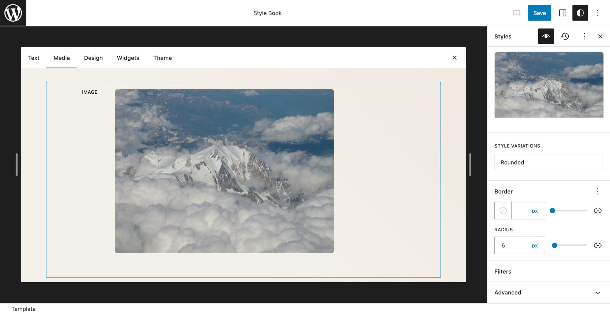
This should make any instance of the Image block on your site appear with a rounded border:
WordPress will also generate this CSS for the nested <img> element within the Image block for both the editor and front end:
.wp-block-image img {
	border-radius: 6px;
}
You can add styles for as many or as few blocks as you want. That’s entirely up to you and what you want to accomplish with your design. Have fun with it!
For a full list of core WordPress blocks that you can style, visit the Core Blocks Reference. Note that this does not include blocks from plugins and other third-party sources.
When targeting a block’s styles, you must know both its namespace and slug. Above, you learned that the Image block has the namespace (core) and slug (image), creating the namespace/slug combination of core/image. All core WordPress blocks have the core namespace, and you can find this information for any block (including from third-party plugins) in its block.json file.
Styling elements nested in blocks
You can also add custom styles for elements that are nested within blocks. This feature gives you a lot of flexibility for contextually styling elements directly within theme.json.
When styling a block’s nested elements, you must pass an elements object directly under the block property: styles.blocks.blockname.elements.
Suppose you wanted a large font size for the PullQuote block but you wanted to create a fluid size for its nested <cite> element that never grew larger than 50% of the parent block or 1.5rem, whichever is the larger of the two.
For this, you need to define the typography.fontSize for both the core/pullquote block and its nested cite element in theme.json:
{
	"version": 2,
	"styles": {
		"elements": {
			"core/pullquote": {
				"typography": {
					"fontSize": "2.25rem"
				},
				"elements": {
					"cite": {
						"typography": {
							"fontSize": "max( 50%, 1.5rem )"
						}
					}
				}
			}
		}
	}
}
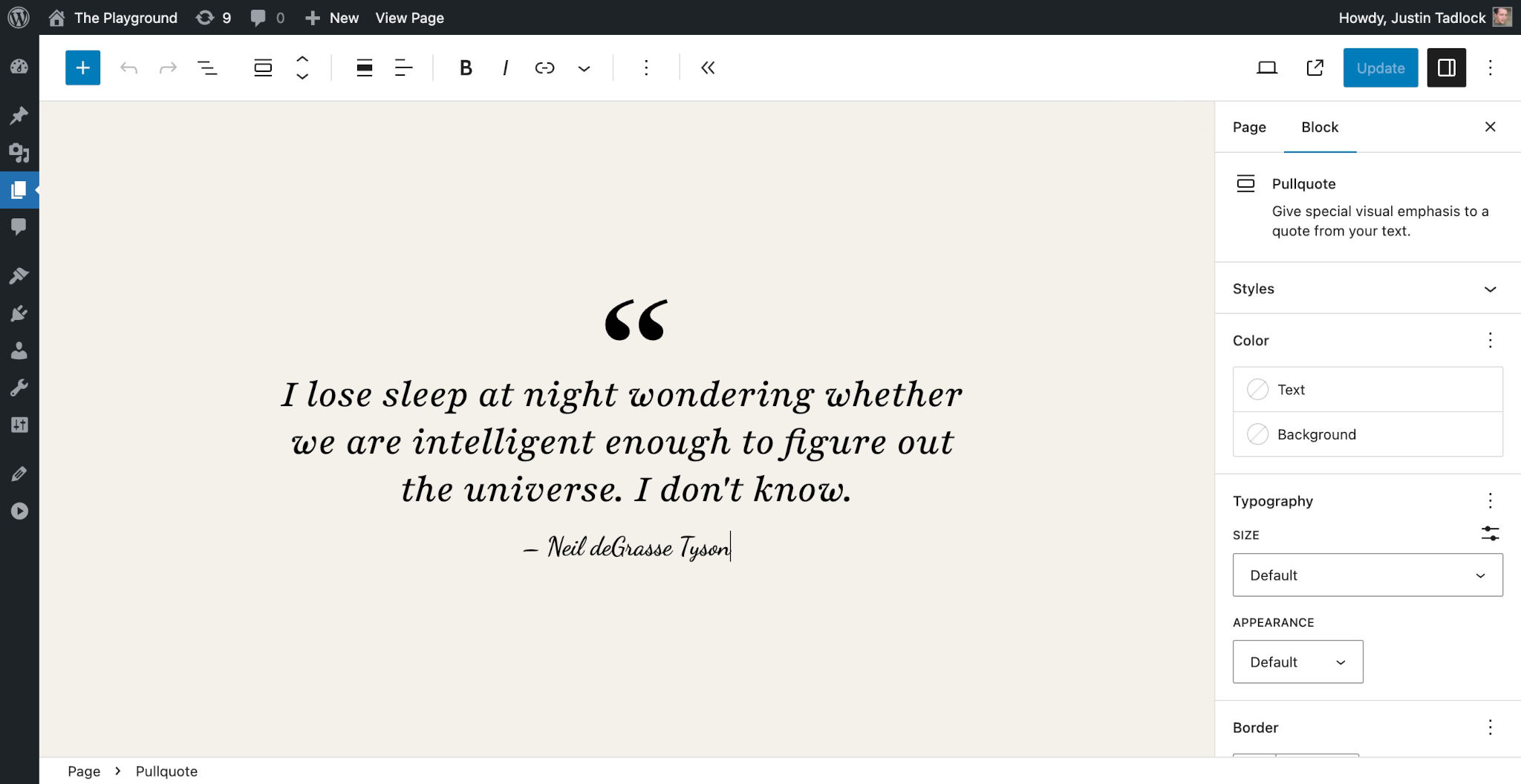
The font-size will now look like this in the editor:
WordPress generates this CSS for styling both the Pullquote block and its nested <cite> element:
.wp-block-pullquote {
	font-size: 2.25rem;
}

.wp-block-pullquote cite {
	font-size: max( 50%, 1.5rem );
}
Styling block style variations (block styles)
Since WordPress 6.2, you can customize the core block style variations (i.e., block styles) via theme.json. This feature allows you to use supported styles without having to write custom CSS in a separate stylesheet.
To customize a block style variation, you must add a nested variations property within the block you want to style in theme.json. Then, each variation can use any of the block’s supported styles.
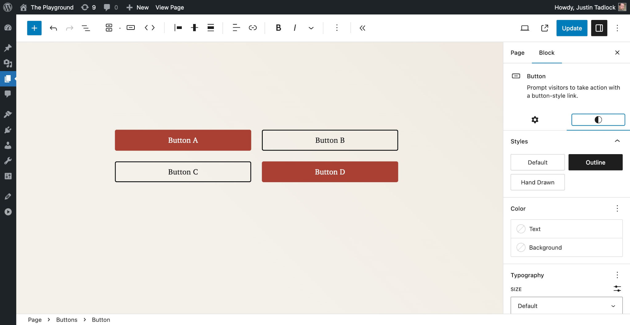
Let’s walk through an example of modifying the Button block’s Outline style variation. Suppose you wanted to define the border color, style, and width that is specific to this block style variation.
Add this code to your theme.json:
{
	"version": 2,
	"styles": {
		"blocks": {
			"core/button": {
				"variations": {
					"outline": {
						"border": {
							"color": "currentColor",
							"style": "solid",
							"width": "2px"
						}
					}
				}
			}
		}
	}
}
You should now see these changes reflected in the editor when the Outline block style variation is selected for the Button block:
The currently available blocks and their core WordPress style variations are:
core/button:outline,fillcore/image:roundedcore/quote:plaincore/site-logo:roundedcore/separator:wide,dotscore/social-links:logos-only,pill-shapecore/table:stripescore/tag-cloud:outline
For a deeper dive into customizing block style variations, check out Customizing core block style variations via theme.json on the WordPress Developer Blog.
Custom block style variations are not currently supported in theme.json. There is an open ticket for the feature. For now, you are limited to the core block style variations.