The settings.shadow property in theme.json currently lets you create custom shadow presets. As of WordPress 6.3, it contains no settings for enabling or disabling UI elements.
Shadow, in this case, refers specifically to the box-shadow CSS feature and is unrelated to text-shadow.
Shadow settings
The settings.shadow property contains two settings that you can configure:
defaultPresets: A boolean value for enabling or disabling the default WordPress shadow presets. Defaults totrue.presets: An array of objects for registering custom shadows for use in your theme or by users.
Here is a look at the default shadow property in theme.json:
{
	"version": 2,
	"settings": {
		"shadow": {
			"defaultPresets": true,
			"presets": [
				{
					"name": "Natural",
					"slug": "natural",
					"shadow": "6px 6px 9px rgba(0, 0, 0, 0.2)"
				},
				{
					"name": "Deep",
					"slug": "deep",
					"shadow": "12px 12px 50px rgba(0, 0, 0, 0.4)"
				},
				{
					"name": "Sharp",
					"slug": "sharp",
					"shadow": "6px 6px 0px rgba(0, 0, 0, 0.2)"
				},
				{
					"name": "Outlined",
					"slug": "outlined",
					"shadow": "6px 6px 0px -3px rgba(255, 255, 255, 1), 6px 6px rgba(0, 0, 0, 1)"
				},
				{
					"name": "Crisp",
					"slug": "crisp",
					"shadow": "6px 6px 0px rgba(0, 0, 0, 1)"
				}
			]
		}
	}
}
As you can see, WordPress registers several default presets that you can use directly in your block styles or that users can select from the interface:
- Natural
- Deep
- Sharp
- Outline
- Crisp
Like all presets, WordPress will generate a CSS custom property for each registered shadow. Shadow presets are named --wp--preset--shadow--{$slug}.
Here is an example of the CSS generated for the default shadow presets:
body {
	--wp--preset--shadow--natural: 6px 6px 9px rgba(0, 0, 0, 0.2);
	--wp--preset--shadow--deep: 12px 12px 50px rgba(0, 0, 0, 0.4);
	--wp--preset--shadow--sharp: 6px 6px 0px rgba(0, 0, 0, 0.2);
	--wp--preset--shadow--outlined: 6px 6px 0px -3px rgba(255, 255, 255, 1), 6px 6px rgba(0, 0, 0, 1);
	--wp--preset--shadow--crisp: 6px 6px 0px rgba(0, 0, 0, 1);
}
Disabling core WordPress shadows
The default shadows available in core will not match the design of every theme. Typically, they will only work well for themes with a white or very light gray background. If your theme uses a different color, you will almost always want to remove these.
But there may be other reasons to disable the defaults. Perhaps you want to limit users to only the shadows that you’ve specifically designed for your theme or simply not like their design.
Whatever the reason, you can remove them by setting settings.shadow.defaultPresets to false in theme.json:
{
	"version": 2,
	"settings": {
		"shadow": {
			"defaultPresets": false
		}
	}
}
Adding custom shadow presets
WordPress lets you register any number of custom shadows. You can add them via the settings.shadow.presets property, which is an array used for storing shadow objects. Each object in this array should contain three values:
name: A human-readable name or label for the shadow that can be translated.slug: A machine-readable slug for the shadow, which is used to build its associated CSS custom property.shadow: A valid CSS value for thebox-shadowCSS property.
Try your hand at registering a few shadows of your own. You can use this theme.json code to get started, which contains several shadow examples:
{
	"$schema": "https://schemas.wp.org/trunk/theme.json",
	"version": 2,
	"settings": {
		"shadow": {
			"presets": [
				{
					"name": "Small",
					"slug": "sm",
					"shadow": "0 1px 2px 0 rgb(0 0 0 / 0.05)"
				},
				{
					"name": "Medium",
					"slug": "md",
					"shadow": "0 1px 3px 0 rgb(0 0 0 / 0.1), 0 1px 2px -1px rgb(0 0 0 / 0.1)"
				},
				{
					"name": "Large",
					"slug": "lg",
					"shadow": "0 4px 6px -1px rgb(0 0 0 / 0.1), 0 2px 4px -2px rgb(0 0 0 / 0.1)"
				},
				{
					"name": "XL",
					"slug": "xl",
					"shadow": "0 10px 15px -3px rgb(0 0 0 / 0.1), 0 4px 6px -4px rgb(0 0 0 / 0.1)"
				},
				{
					"name": "2XL",
					"slug": "2-xl",
					"shadow": "0 20px 25px -5px rgb(0 0 0 / 0.1), 0 8px 10px -6px rgb(0 0 0 / 0.1)"
				},
				{
					"name": "Inner",
					"slug": "inner",
					"shadow": "inset 0 2px 4px 0 rgb(0 0 0 / 0.05)"
				}
			]
		}
	}
}
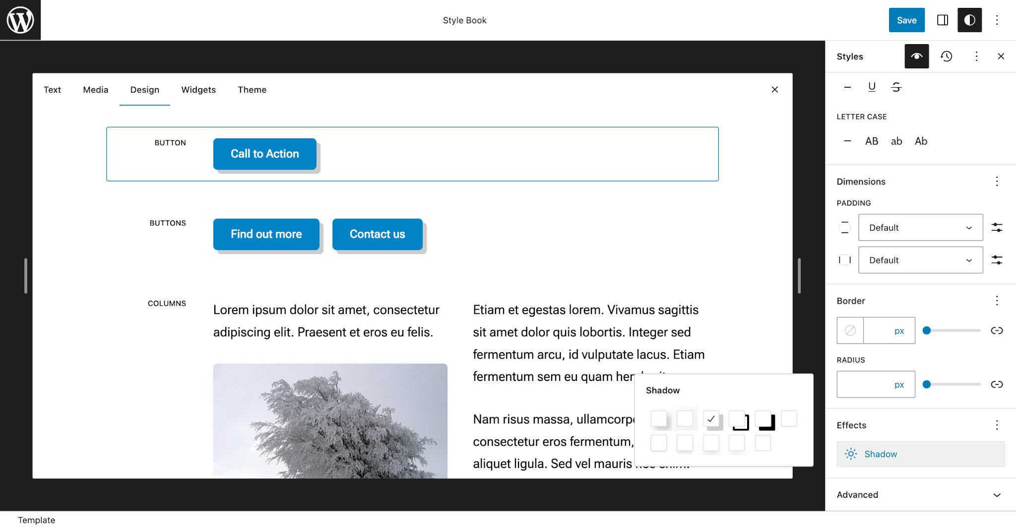
Currently, this only shows a shadow option for the core Button block in the user interface. This control can be accessed via Appearance > Editor > Styles > Style Book in the WordPress admin. From there, select the Button block and locate the Shadow option in the Effects tab, as shown here:

It’s possible for third-party blocks to also utilize shadow presets and show them in the interface in the post, template, or site editors.
Like other presets, you can also use your custom shadows (or core WordPress shadows) in theme.json Styles.
For a deeper dive into this feature, read Using the box-shadow feature for themes on the WordPress Developer Blog.