Color is one of the primary components of design. You can create a theme that is dark and moody, fun and lighthearted, or clean and corporate. Which colors you choose will define how the world sees your theme, and WordPress provides a range of color-specific configuration options that you can set.
The settings.color property in theme.json gives you full control over how colors, gradients, and more work within your theme. Primarily, the goal is for configuring whether specific controls appear in the user interface, but it also lets you register custom presets that users can select.
Color settings
color is an object that’s nested directly within the top-level settings property in theme.json. It is used to configure multiple color-specific settings that appear in the user interface.
Take a look at the color property in the context of a theme.json file with its default values:
{
	"version": 2,
	"settings": {
		"color": {
			"background": true,
			"custom": true,
			"customDuotone": true,
			"customGradient": true,
			"defaultDuotone": true,
			"defaultGradients": true,
			"defaultPalette": true,
			"duotone": [],
			"gradients": [],
			"link": true,
			"palette": [],
			"text": true
		}
	}
}
As you can see, most of the settings accept a boolean value, meaning that you can set them to either true or false. Others, like duotone, gradients, and palette take an array of values. These are the ones where you can register custom presets, and you will learn how to create them in this doc.
Color settings can largely be broken down into four groups that let you:
- Enable or disable settings in the UI.
- Enable or disable user customizations of colors, duotones filters, and gradients.
- Enable or disable the core WordPress color, duotone, and gradient presets.
- Register custom color, duotone, and gradient presets.
In the following sections, you will learn how each of these work.
Text, background, and link settings
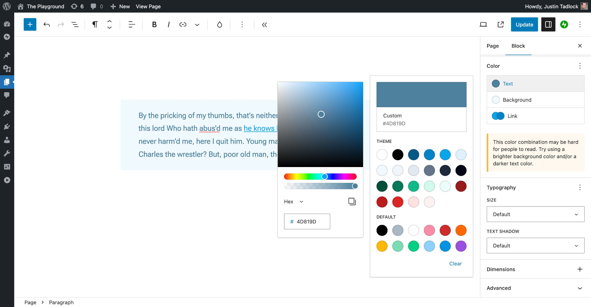
In the block editor, you will often see Text, Background, and Link settings under the Color panel for a block, at least for those blocks that opt into support of one or more of them.
These options appear like this in the interface:

But just because a block registers support for text, background, and link colors doesn’t mean that your theme must also support them. That’s entirely up to you.
WordPress lets you decide whether your theme supports any or all of the settings by defining the background, link, and text properties under settings.color in theme.json:
{
	"version": 2,
	"settings": {
		"color": {
			"background": true,
			"link": true,
			"text": true
		}
	}
}
By default, all are set to true, so their associated controls will appear in the block interface. If you want to disable a feature, you only need to set its value to false in your theme.json.
For an exercise, try disabling the background color but still allow text and link colors:
{
	"version": 2,
	"settings": {
		"color": {
			"background": false,
			"link": true,
			"text": true
		}
	}
}
Some core WordPress blocks and third-party blocks may have other color options that users can configure. These cannot be enabled or disabled via theme.json since they are not a standard component of the color system.
Enabling and disabling user customizations
One of the major decisions that you will need to make for your theme is whether you want to allow users to create custom colors. On the one hand, enabling custom colors gives users a ton of flexibility and freedom to truly make their site their own. But maybe you’ve put in a lot of work getting the color scheme just right and want to make sure the user is only picking colors from a predetermined palette.
This may change depending on whether you are building a publicly-distributed theme vs. one for a client. Each project is unique, and you get to be the judge on what’s best for your design.
WordPress currently allows user-customized colors for three different features, which you can enable or disable via theme.json:
custom: Whether the user can create and use custom colors.customDuotone: Whether the user can create custom duotone filters (typically used for overlays on blocks with images).customGradient: Whether the user can create custom background gradients.
By default, each of these features are enabled in theme.json:
{
	"version": 2,
	"settings": {
		"color": {
			"custom": true,
			"customDuotone": true,
			"customGradient": true
		}
	}
}
User-customized colors
When the settings.colors.custom value is set to true (the default), users will be able to define custom colors for individual blocks, as shown here:

Because this is enabled by default, try turning it off by setting the property to false in your theme.json file:
{
	"version": 2,
	"settings": {
		"color": {
			"custom": false
		}
	}
}
Now users will only be able to select from preset colors.
User-customized duotone filters
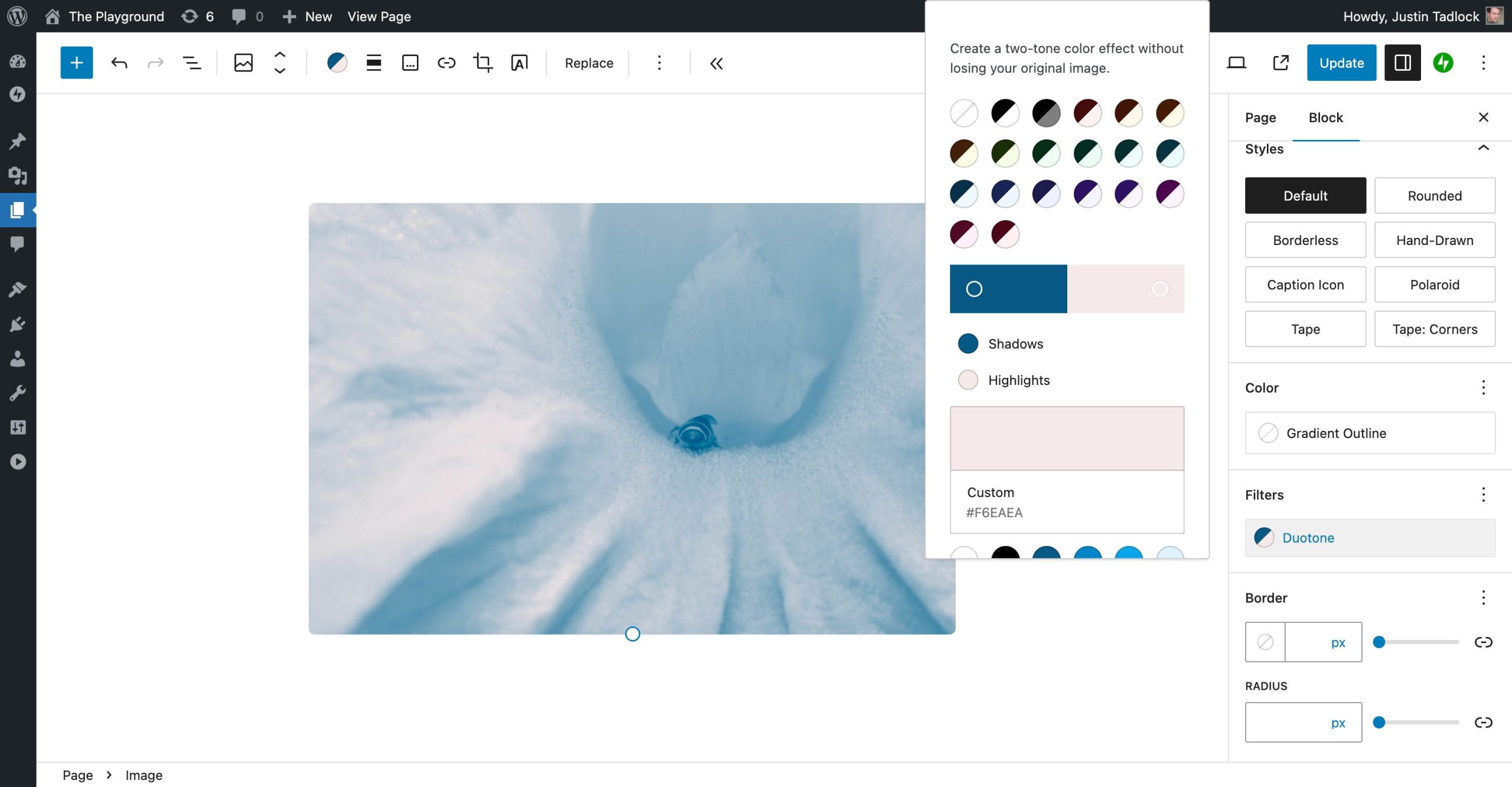
Duotone filters are generally supported by blocks that display an image. The filter is applied as an overlay above the image, creating a duotone effect. The two-color filter allows users to select a shadow and highlight color.
By default, users can create custom duotone filters as shown here:

Since custom duotone filters are enabled by default, you must set the settings.color.customDuotone property to false if you do not want to allow users to add custom colors:
{
	"version": 2,
	"settings": {
		"color": {
			"customDuotone": false
		}
	}
}
User-customized gradients
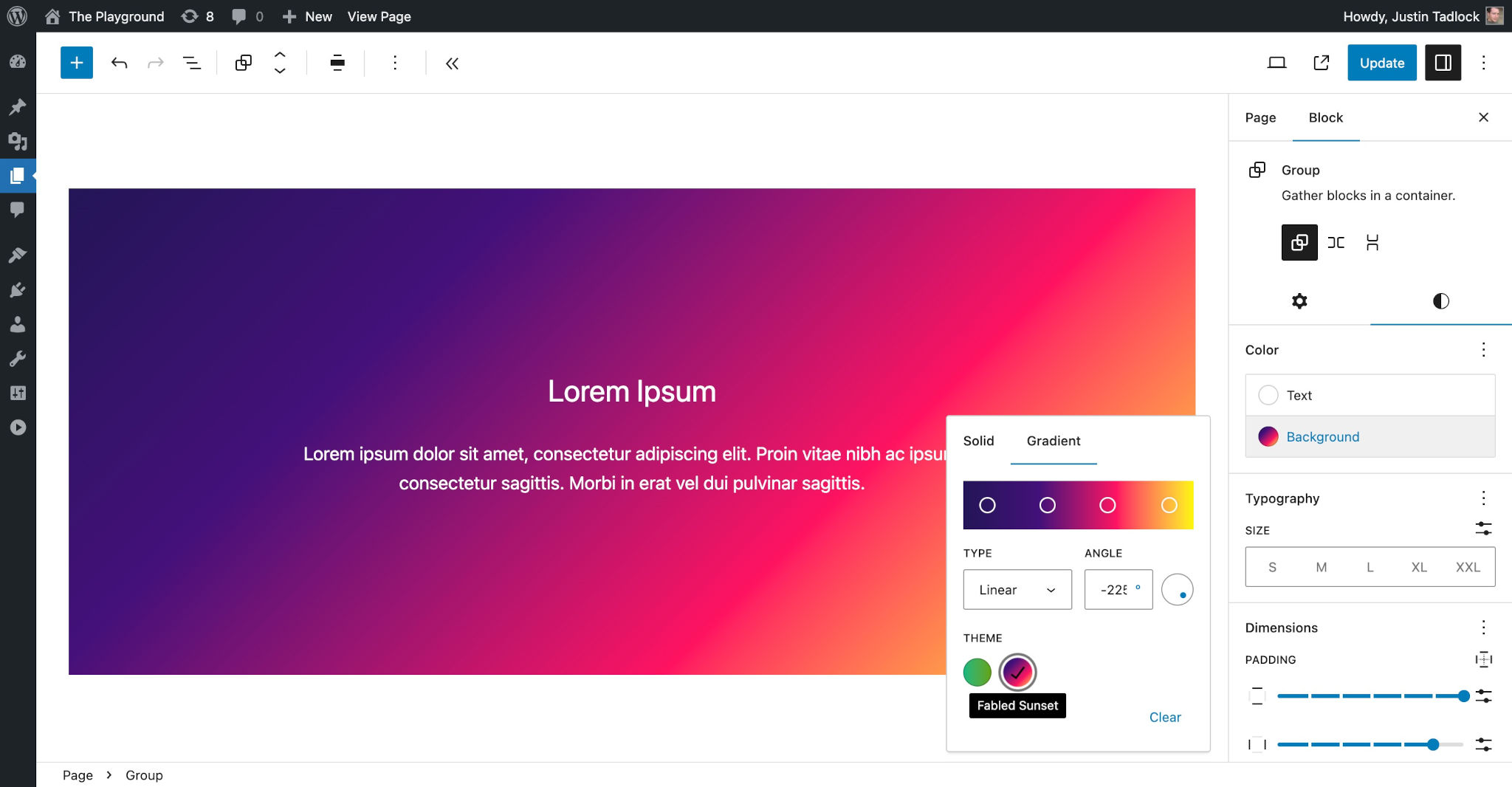
Like most other color settings, custom gradients are enabled by default. This allows your theme users to define a gradient background for any block that supports it as shown here:

If you’ve carefully fine-tuned the gradients you want available to the user or simply want to disable custom gradients altogether, you can turn this feature off by setting settings.color.customGradient to false in theme.json:
{
	"version": 2,
	"settings": {
		"color": {
			"customGradient": false
		}
	}
}
Default WordPress presets
WordPress creates its own presets for each of the color features. As is the case with user-defined colors, you will need to decide whether you want to give users access to these. They will often clash with your theme’s color palette, but you may also opt to give users complete freedom to decide on their own.
WordPress currently allows user-customized colors for three different features, which you can enable or disable via theme.json:
defaultDuotone: Whether the user can select from WordPress’ default duotone filter presets (typically used for overlays on blocks with images).defaultGradients: Whether the user can select from WordPress’ default background gradient presets.defaultPalette: Whether the user can select colors from WordPress’ default color palette.
By default, each of these features are enabled in theme.json:
{
	"version": 2,
	"settings": {
		"color": {
			"defaultDuotone": true,
			"defaultGradients": true,
			"defaultPalette": true
		}
	}
}
It’s important to note that, even if these settings are disabled, WordPress will still generate the CSS custom properties for its presets. This is for backward-compatibility and so that users do not lose colors, gradients, or duotone filters that they have previously chosen when using another theme.
Default color palette
WordPress ships with its own color palette, which is enabled by default for themes that have not opted out of it. It contains the following colors:
- Black
- Cyan bluish gray
- White
- Pale pink
- Vivid red
- Luminous vivid orange
- Luminous vivid amber
- Light green cyan
- Vivid green cyan
- Pale cyan blue
- Vivid cyan blue
- Vivid purple
Color presets are available for the Text, Background, Link, and potentially other color controls as shown in this screenshot:

There are times when you might want to disable the core WordPress colors, and you can do so by setting settings.color.defaultPalette to false in theme.json:
{
	"version": 2,
	"settings": {
		"color": {
			"defaultPalette": false
		}
	}
}
Default duotone filters
WordPress has several default duotone filter presets that it defines:
- Dark Grayscale
- Grayscale
- Purple and yellow
- Blue and red
- Midnight
- Magenta and yellow
- Purple and green
- Blue and orange
These will appear for blocks that support duotone filters (generally used as an overlay for blocks with images), as shown here:

If you do not want to allow your theme users to select from the default duotone presets, you must set settings.color.defaultDuotone to false in theme.json:
{
	"version": 2,
	"settings": {
		"color": {
			"defaultDuotone": false
		}
	}
}
Default gradients
By default, WordPress defines several gradients for users to pick and choose from. These can be added to blocks that support gradient backgrounds:
- Vivid cyan blue to vivid purple
- Light green cyan to vivid green cyan
- Luminous vivid amber to luminous vivid orange
- Luminous vivid orange to vivid red
- Very light gray to cyan bluish gray
- Cool to warm spectrum
- Blush light purple
- Blush bordeaux
- Luminous dusk
- Pale ocean
- Electric grass
- Midnight
They appear as shown here in the Background > Gradient control in the user interface:

The core WordPress gradient presets are enabled by default, but there are times when you may want to disable them for your theme. You can do so by setting settings.color.defaultGradients to false in your theme.json:
{
	"version": 2,
	"settings": {
		"color": {
			"defaultGradients": false
		}
	}
}
Registering custom color presets
Just like WordPress defines its own color, duotone, and gradient presets, so can you. This is a powerful feature that allows you to customize how your theme looks on the front end of the site and which colors your theme users can select from in the block editor.
You can set presets for three different features via theme.json:
duotone: An array of duotone filters that a user can choose from (typically used for overlays on blocks with images).gradients: An array of background gradient objects that a user can choose from.palette: An array of color objects that a user can choose from.
Here is what this would look like in theme.json (note that there are no presets yet registered):
{
	"version": 2,
	"settings": {
		"color": {
			"duotone": [],
			"gradients": [],
			"palette": []
		}
	}
}
WordPress will automatically generate CSS custom properties for each of your presets in the form of --wp--preset--{type}--{slug}. So a color palette preset with the slug of contrast will become --wp--preset--color--contrast.
You can access these in your theme.json styles via the CSS custom property itself or through a special naming convention of var:preset|{type}|{slug}. You will learn more about this in the theme.json Styles documentation.
WordPress will also sometimes generate CSS classes based on the preset. For example, the contrast color palette preset will have an associated class for .has-contrast-color when used as a block’s text color and .has-contrast-background-color when used as a background.
Custom color palette
When building a theme you will almost always want to register your own color palette. For some themes, this may be as simple as a couple of colors. Others could potentially include dozens of colors.
In the end, it’s your theme, and WordPress gives you the tools to build your design.
You can register custom colors via the settings.color.palette property in theme.json:
{
	"version": 2,
	"settings": {
		"color": {
			"palette": []
		}
	}
}
The palette property accepts an array of color objects, and each of those objects has three properties that you must set:
color: A valid CSS color value.name: The label for your color, which will be internationalized (so that it can be translated) and shown to the user in some contexts, such as tooltips.slug: A unique machine-readable slug/ID for your color. This is used to generate CSS custom properties and CSS classes.
Suppose you wanted to register three colors named Base, Contrast, and Primary for your theme. They would appear in the color picker like so:

For your custom colors to appear in the interface, you must add them to the settings.color.palette array as shown in this code snippet:
{
	"version": 2,
	"settings": {
		"color": {
			"palette": [
				{
					"color": "#ffffff",
					"name": "Base",
					"slug": "base"
				},
				{
					"color": "#000000",
					"name": "Contrast",
					"slug": "contrast"
				},
				{
					"color": "#89CFF0",
					"name": "Primary",
					"slug": "primary"
				}
			]
		}
	}
}
You can add as few or as many colors as you want, and there are no official naming schemes.
Despite there not being an official naming scheme for colors, the base and contrast slugs are de facto standards that were set forth by the Twenty Twenty-Three default theme. It is recommended to use base for the site background and contrast for text. This provides the greatest future-proofing and compatibility between themes. It also gives plugin authors a standard set of fallback colors when needed.
Custom gradients
Like colors, you can also register a custom set of gradient presets. And there are no limits on the number of gradients your theme can support, so go wild and have a bit of fun!
You can register custom gradients via the settings.color.gradients property in theme.json:
{
	"version": 2,
	"settings": {
		"color": {
			"gradients": []
		}
	}
}
The gradients property accepts an array of gradient objects, and each of those objects has three properties that you must set:
gradient: A valid CSS background gradient value.name: The label for your gradient, which will be internationalized (so that it can be translated) and shown to the user in some contexts, such as tooltips.slug: A unique machine-readable slug/ID for your gradient. This is used to generate CSS custom properties and CSS classes.
Let’s suppose you have a couple of gradients named Emerald and Fabled Sunset that you want to add for your theme as shown here:

Add the following to your theme.json to register them:
{
	"version": 2,
	"settings": {
		"color": {
			"gradients": [
				{
					"gradient": "linear-gradient(to right, #10b981, #64a30d)",
					"name": "Emerald",
					"slug": "emerald"
				},
				{
					"gradient": "linear-gradient(-225deg,#231557,#44107a 29%,#ff1361 67%,#fff800)",
					"name": "Fabled Sunset",
					"slug": "fabled-sunset"
				}
			]
		}
	}
}
Custom duotone filters
Like colors and gradients, you can register any number of custom duotone filters for your theme. This will allow your users to apply customizations directly to Image and other blocks that support duotone.
You can register custom gradients via the settings.color.duotone property in theme.json:
{
	"version": 2,
	"settings": {
		"color": {
			"duotone": []
		}
	}
}
The duotone property accepts an array of duotone objects, and each of those objects has three properties that you must set:
colors: An array containing two valid CSS color values.name: The label for your duotone filter, which will be internationalized (so that it can be translated) and shown to the user in some contexts, such as tooltips.slug: A unique machine-readable slug/ID for your duotone filter. This is used to generate CSS custom properties and CSS classes.
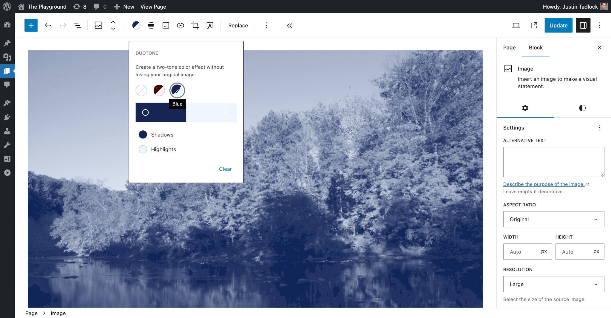
Suppose you wanted to create to create two duotone filters—one for red shadows and highlights and a similar one for blues, as shown below:

To register the Red and Blue dutone filters, add this code to your theme.json:
{
	"$schema": "https://schemas.wp.org/trunk/theme.json",
	"version": 2,
	"settings": {
		"color": {
			"duotone": [
				{
					"colors": [
						"#450a0a",
						"#fef2f2"
					],
					"name": "Red",
					"slug": "red"
				},
				{
					"colors": [
						"#172554",
						"#eff6ff"
					],
					"name": "Blue",
					"slug": "blue"
				}
			]
		}
	}
}
Duotone does not currently support CSS custom properties or references and cannot be dynamically generated. There is an open ticket to solve this issue.